Preamble:
The Lumo project is a fictitious dark chocolate branding concept inspired by the observation that dark chocolate is often marketed as a simple, straightforward bar, rarely extending beyond combinations like almonds, berries, or granola.
The Problem:
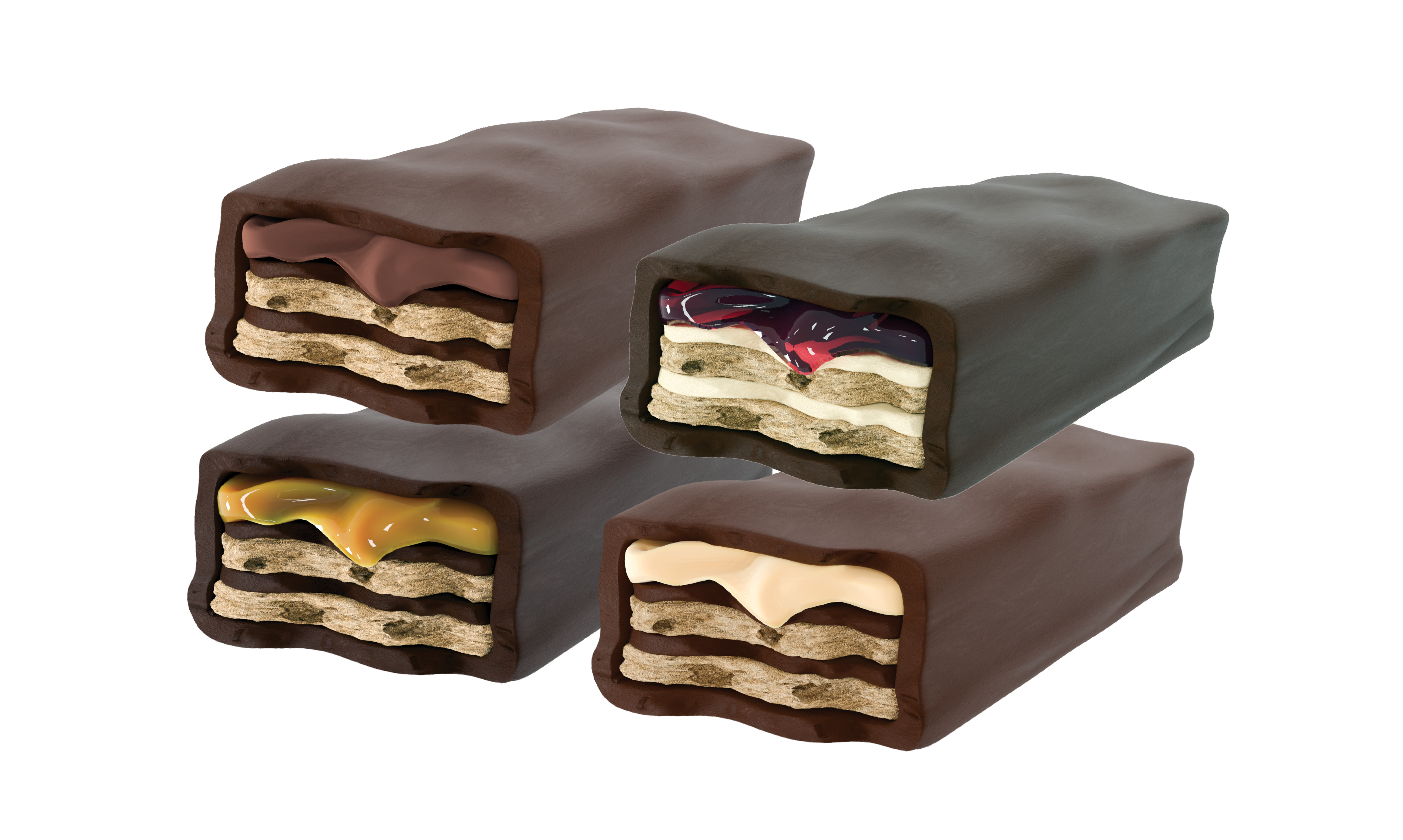
As a designer drawn to stronger, richer tastes, I noticed a lack of dark chocolate options that pair bold, semi-sweet flavour with the playful combinations found in bars like KitKat, Hershey’s, and Twix. While milk chocolate dominates the market, there’s an audience, like myself, who crave the bitterness of dark chocolate in a more approachable, fun, and compact form.
Opportunities
The project involves an imaginary brand refresh, developing a bold and strategic visual identity to reposition the product and make it stand out on mainstream retail shelves. Existing dark chocolate products are often positioned to be health-oriented or luxury-driven. The packaging and design are rarely innovated beyond their traditional rectangular bar form, making it seemingly obsolete or uninteresting in checkout areas.

The Process:
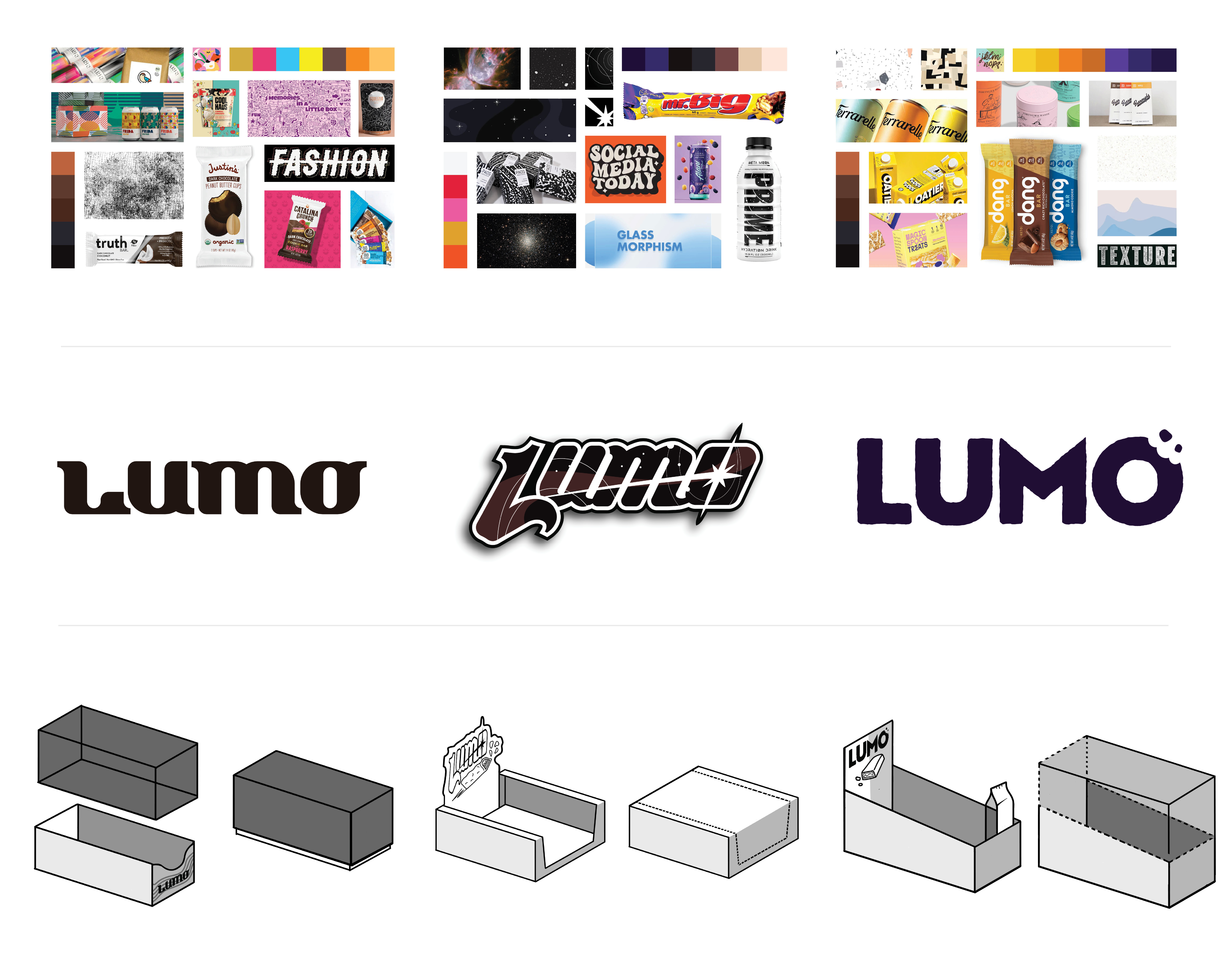
I set out to develop a bold and strategic visual identity to position the product appropriately on mainstream retail shelves. I explored engaging word marks and names that could position Lumo into that unique space. Short, sweet and impactful, Lumo immediately stood out as a compelling name, bringing a juxtaposition into the name. Lumo has many associations with light and space, as Lumo stems from the meaning behind the name Lumo, drawn from lumen (light) and orbitals.
The Process Continued
3 Distinct variations were made, exploring ways to stand out visually. One leaned more to the health-conscious consumer, while the other would easily attract someone in the fitness or outdoors industry. But there was one that stood out...
Visual Brand Strategy:
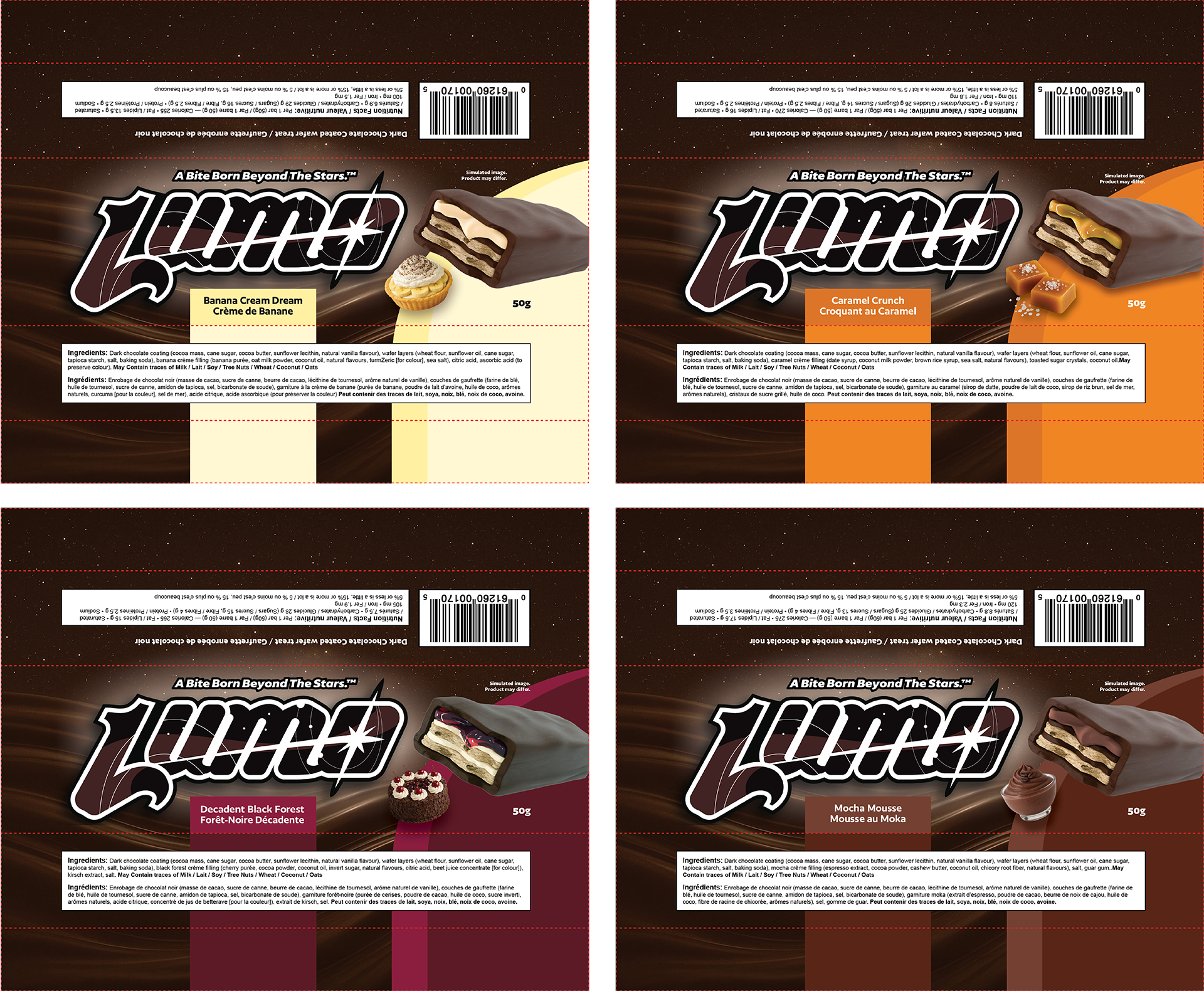
An Idea to capitalize on Lumo’s other associations was to merge space and orbital themes with the dark chocolate themes, strengthening the emphasis on smooth dark chocolate taste by associating it with the depth of space. The name became a good fit, creating a powerful metaphor for the brand’s mission: to shift perceptions of dark chocolate from something intense and exclusive to something light, flavourful, inviting, and approachable.
The chosen mark paired a bold logo-mark, punchy typography with clean product photography and a surreal visual style, brought to life through a mix of photo-manipulation and curated AI-driven upscaling to create unique space imagery and swirling dark chocolate textures. The system is intuitively age-neutral, balancing playful, narrative-driven elements with a clean, structured aesthetic which appeals across demographics through a theme rooted in the universal wonder of space.

Web Design:
The result is Lumo, a brand that blends nostalgia with a modern, space-inspired identity and flavour-forward design to create something fresh and familiar. The project deliverables include custom packaging, product renders, retail displays, and brand guidelines. Each of these is designed to ensure consistency and cohesion across every brand touchpoint. The system is built with scalability in mind, allowing for growth across new flavours, formats, and campaigns.
.jpg)